
Today, people use many different types of screens — phones, tablets, laptops, desktops, even smart TVs. Because of this, websites need to work on all screen sizes. But old designs that use fixed pixel sizes often break or look bad on some devices. That’s where pxless design comes in.
Pxless is a smarter way to design websites that adjust to any screen size. It doesn’t lock things into fixed pixels. Instead, it uses flexible units that move, grow, or shrink based on the device. In this article, we’ll explain what pxless design means, why it’s important, and how it helps create better websites for everyone.
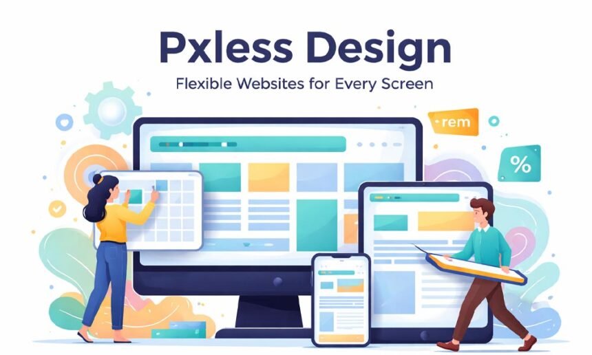
What Does Pxless Design Mean?
Pxless design means building websites without using fixed pixel sizes. Instead of saying something should be “200 pixels wide,” pxless design might say, “Make this 50% of the screen” or “Make this text 1.5 times bigger than the base size.”
This kind of design uses flexible units like percentages (%), rem, em, vw, and vh. These units allow websites to respond to different screen sizes. So whether someone is using a phone, tablet, or desktop, the website still looks good and works smoothly.
Pxless isn’t about removing control. It’s about making smarter choices so designs work naturally everywhere — without needing lots of changes or breakpoints.
Why Old Pixel Designs Don’t Work Anymore
In the past, websites were mostly viewed on desktop screens. Designers used fixed pixel sizes because screen sizes didn’t change much. But now, everything is different.
Today, people visit websites from phones, tablets, smartwatches, and giant screens. A layout that looks good on one screen might look broken on another. Pixel-based designs often:
-
Make text too small on phones.
-
Cause overlapping when people zoom in.
-
Break the layout when screen sizes shrink or grow.
-
Ignore user settings like larger font preferences.
These issues make websites hard to use, especially for people with vision needs. In short, fixed pixels don’t work well in today’s digital world.
Core Ideas Behind Pxless Design
Pxless design is built on a few simple but powerful ideas. These help websites feel more natural and comfortable for everyone.
-
Designs change with screen size: Layouts are not fixed. They move, stretch, or stack based on the device.
-
Text scales naturally: Font sizes are flexible, so reading stays easy no matter the screen or zoom level.
-
Spacing adapts: Gaps and padding adjust to fit the layout and content.
-
User settings matter: If someone increases their font size or zoom level, the layout still works.
-
Balance over perfection: Pxless is about smart, balanced design — not exact pixel matching.
So instead of saying “This must be exactly 400px,” pxless asks, “How can this look good on any screen?”
Main Units Used in Pxless Design
Pxless design uses special units that are more flexible than pixels. Let’s look at a few:
-
% (percent): Good for setting widths that change with screen size.
-
rem: Based on the root font size. Great for consistent text and spacing.
-
em: Like rem, but based on the parent element. Helpful for small components.
-
vw / vh: Based on screen width and height. Helps size things relative to the screen.
For example, instead of usingfont-size: 16px, you might write font-size: 1rem. If the user increases the base size in their settings, the text scales up automatically — and everything stays readable.
These units give you more control through flexibility, not strict rules.
How Layouts Work Without Pixels
If you’re used to using pixels, you might wonder — how do we create layouts without them?
The answer: modern layout tools like Flexbox and CSS Grid.
-
Flexbox: Great for building rows or columns that stretch or shrink. It works well for navbars, cards, and buttons.
-
CSS Grid: Perfect for building full-page layouts with many parts. You can create complex designs that still adapt to different screens.
-
Auto layout: Lets content decide how big things should be.
-
Fluid typography: Text that grows or shrinks depending on screen size.
These tools let you skip most breakpoints because the layout already adjusts naturally. That means less code, fewer bugs, and a better experience for everyone.
Benefits of Using Pxless Design
Using pxless design gives benefits to both users and teams.
For Users:
-
Easier reading on all devices.
-
No broken layouts when zooming or changing font size.
-
Clean spacing that adjusts to the screen.
-
Stable layout — things don’t jump around or overlap.
For Teams:
-
Less maintenance — fewer breakpoints to fix.
-
Faster updates — no need to redesign for every screen.
-
Better performance — cleaner code loads faster.
-
More scalable — easier to grow your site or app over time.
In simple words, pxless saves time, reduces stress, and makes users happier.
How Pxless Helps with Accessibility
Accessibility means making sure everyone can use your website — including people who have vision problems or need extra support. Pxless design is great for this.
When you use flexible units like rem, text can grow or shrink without breaking the layout. If a person zooms in or changes their font settings, the design still works. Nothing overlaps or disappears.
It also helps screen readers. When your design is clean and flexible, assistive tools can read it better. That means more people can enjoy and use your website, no matter their needs.
Where Pxless Design Works Best
You might be wondering — where should I use pxless design? The answer is: almost everywhere.
It’s perfect for blogs and content sites, where the text needs to be easy to read on any screen. It works well for business websites, which often have many users coming from different devices.
Web apps, dashboards, e-commerce stores, and media sites all benefit from pxless design too. Basically, if your site has changing content or many users, pxless can make it better, cleaner, and easier to use.
Common Myths About Pxless
Some people think pxless design means “no control.” That’s not true. You still have control — you’re just using smarter tools.
Others believe pxless layouts are messy. But that’s only if they’re built without a system. When done right, pxless design is actually cleaner and more balanced.
Another myth is that you can never use pixels. That’s also false. Pixels can still be used for small things, like border thickness or icons. The goal is not to avoid pixels completely — just not depend on them for layout.
Challenges You Might Face
Switching to pxless design can feel different at first. You have to learn new units like rem, %, and vw. But with some practice, they start to feel easy.
It also takes a shift in thinking. Instead of designing fixed boxes, you think in flexible parts. You focus more on flow and spacing than on exact sizes.
Testing is also important. You’ll need to check your designs on different screens and settings. But once you build a good system, testing becomes faster and smoother.
Best Practices for Smart Pxless Design
To use pxless design well, it helps to follow a few simple rules.
Start with your font scale. Use rem for all text sizes so they stay flexible. Then define your spacing rules using tokens or relative units. This makes things look consistent.
Build flexible components. Don’t set fixed widths or heights unless needed. Let the content decide.
Use max-width for large screens so your content doesn’t stretch too far. And always test with long words, zoomed text, and user font changes. It helps you avoid surprises.
What the Future Looks Like with Pxless
Technology is changing fast. New screen types are coming — foldable phones, smart watches, AR glasses, and more.
Pxless design is ready for that future. It doesn’t depend on fixed shapes. Instead, it adapts. That means your design will still work well, no matter what the screen looks like.
Accessibility rules are also getting stronger. Pxless helps you stay ahead by building websites that are easy to use for everyone.
And as design systems grow smarter, pxless design will fit right in. It’s clean, flexible, and built to last.
Conclusion
Pxless design is not just a trend — it’s a smarter, better way to build for today’s world. It helps your site work on every screen, stay easy to read, and feel good to use.
It’s not about giving up control. It’s about gaining flexibility. It’s about building websites that adjust, support all users, and last through future changes.
So if you’re ready to design smarter — for every screen, every user, and every future device — pxless design is the way to go.
FAQs
What is pxless design?
Pxless design is a way of building websites without using fixed pixel sizes. Instead of locking elements to a certain width or height (like 300px), it uses flexible units like %, rem, and vw that adjust to screen size. This helps your site look good on phones, tablets, desktops, and all other devices.
Why is pxless better than pixel-based design?
Pixel-based designs often break on small screens or when people zoom in. Text may become too small or too big, and layouts can look messy. Pxless design fixes these problems by creating flexible layouts that respond to screen changes and user settings. It gives a better experience for everyone.
Can I still use pixels in pxless design?
Yes, you can still use pixels for small things like borders, shadows, or icons. Pxless design doesn’t ban pixels — it just avoids depending on them for layout and spacing. The main idea is to let your design adapt naturally instead of forcing fixed sizes.
What units should I use instead of pixels?
Use flexible units like:
-
%for layout widths. -
remfor text and spacing (based on root font size). -
emfor scaling inside components. -
vwandvhfor screen-size-based elements.
These units help your design scale smoothly on all devices.
Is pxless design good for accessibility?
Yes! Pxless design is very good for accessibility. It respects user settings like larger font sizes or zooming. It also works better with screen readers and other assistive tools. This makes it easier for people with different needs to use your website.
Where can I use pxless design?
You can use pxless design on almost any type of website or app. It works well for:
-
Blogs and content sites
-
Business websites
-
Web apps and dashboards
-
E-commerce stores
-
Media platforms
If your content changes or you expect users on many screen sizes, pxless is a smart choice.
Is it hard to learn pxless design?
At first, pxless design may feel different, especially if you’re used to working with pixels. But it gets easier with practice. Once you understand the new units and layout tools (like Flexbox and Grid), you’ll find that pxless design actually makes your work faster and more flexible.
Do I still need to use breakpoints with pxless?
Not as much. One of the best things about pxless design is that it reduces the need for many breakpoints. Flexible layouts, fluid typography, and auto-sizing tools help your design adjust without manual changes. You might still use a few breakpoints for special cases, but much less overall.
Does pxless design work with design systems?
Yes, pxless works very well with design systems. You can use rem for text, tokens for spacing, and flexible components that scale. This keeps your system consistent and easy to manage. Pxless fits naturally into modern design workflows.
Is pxless design future-proof?
Yes, pxless is built for the future. As more new devices come out — foldable phones, watches, smart displays — pxless layouts will keep working. They don’t depend on fixed shapes or sizes. They adjust, scale, and respond to whatever comes next.
You may also read: Courseto Explained Simply – Learn Skills That Actually Help You